Usability Testing made dead easy. See how in our live webinar. Register now.
Your savvy research assistant is here. Check out Poocho Studio.
Even though the Studio launch took the spotlight, our product team has been busy behind the scenes, quietly tuning up the rest of the platform to make your research flow smoother than ever.
Here are a few fresh updates we’ve rolled out on the Poocho platform, all designed to reduce friction, save you time, and help you get the most out of the platform.
Too many emails not sparking joy?
No more email floods every time someone applies to your study. Now, you’ll receive one daily digest with:
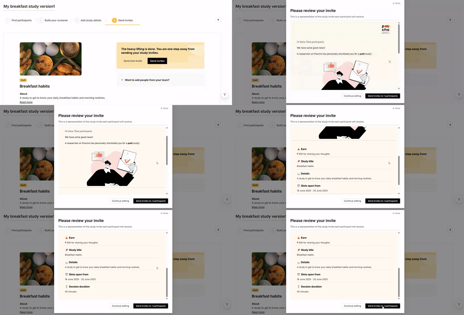
Preview your invite before sending it out
Want to see what participants will receive? You can now preview the participant email before it goes out, so you can make sure it looks just right.

Open screener files in-browser
Any files participants attach to their screener responses will now open in a new tab instead of downloading, making shortlisting a faster and clutter-free experience.
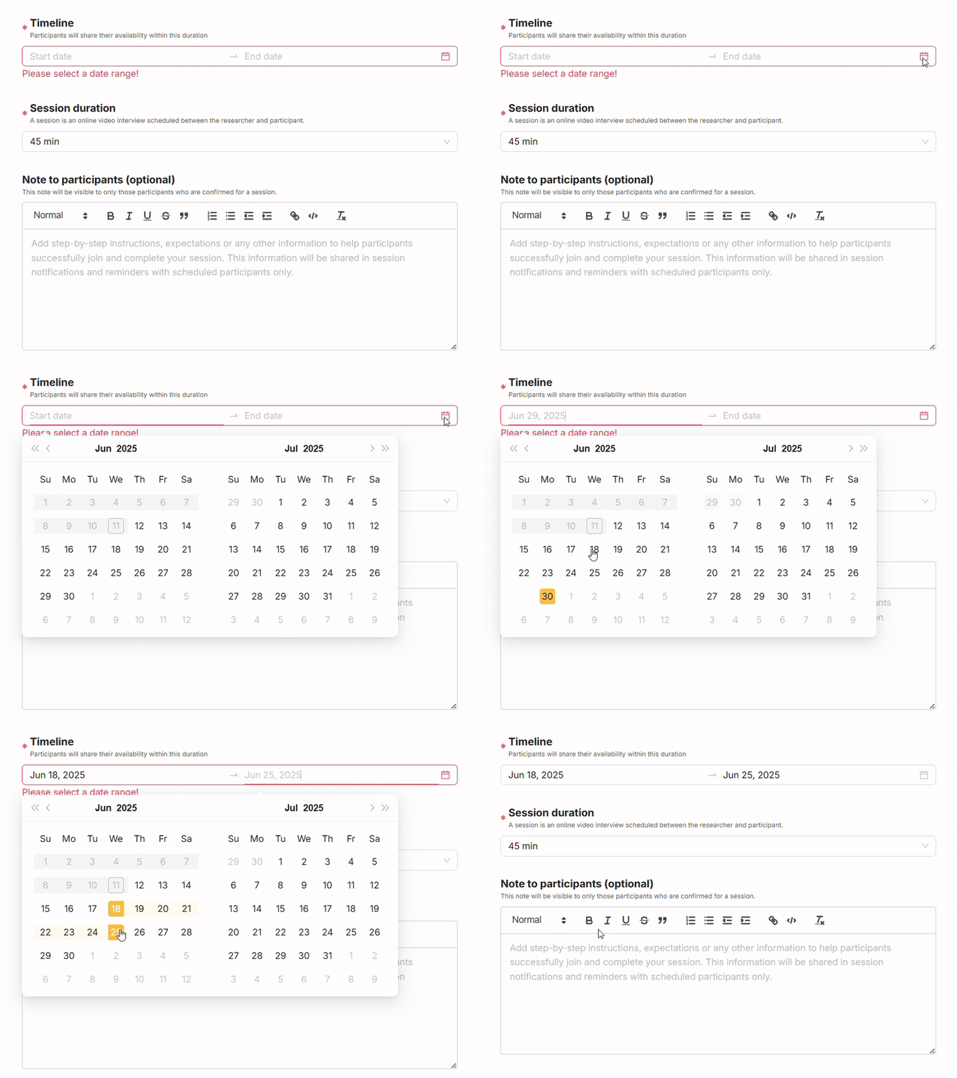
Set study end dates to keep things on track
You can now define a study end date upfront. This helps participants share their availability more accurately and ensures your sessions get wrapped up on schedule.

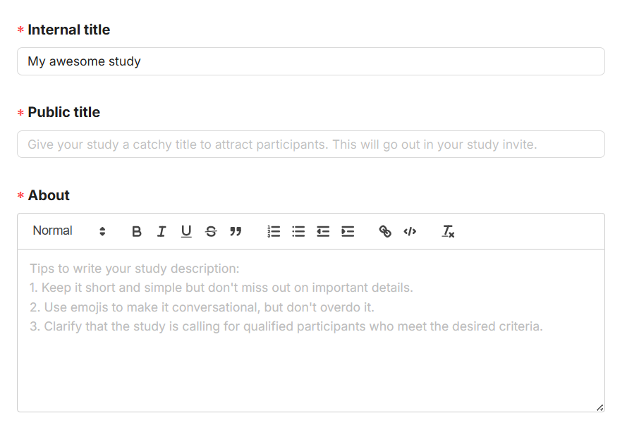
Better “About” sections, with a little help from us
We’ve added tips from our in-house researchers to guide you when writing your study's “About” section. You can now also use rich text to make it easier for participants to read and understand.

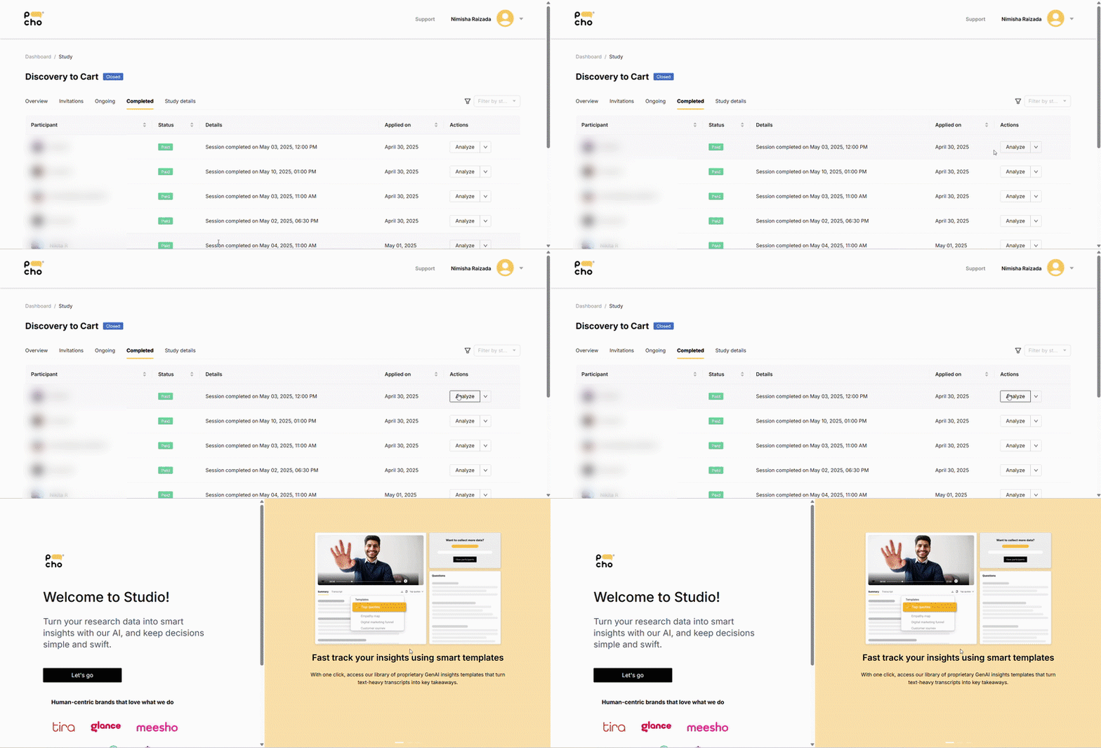
Quick links from Recruit to Studio
Need to jump from recruiting to analyzing? Now you can hop directly from Recruit to Studio at the click of a button. It’s a small shortcut, but one that makes a big difference to your workflow.

As always, we’re building with you in mind. If you’ve got feedback or ideas, we’d love to hear them. Feel free to email us at desk@poocho.co